Performance Comparison Between Different Map Providers

I have been working on a little side project in my spare time that uses maps. I was appalled at the performance of my web app on mobile (specially when using cell data). I did a little digging and I found that most of the lag was not coming from my app, instead it was coming from Google Maps which, in my Nexus phone, was loading over 1MB of images, 4 custom web fonts and making a whopping total of 47 HTTP calls.
Don't get me wrong, I am a fan of Google maps but for such a key/mainstream product I find it surprisingly heavy. I decided to look into different map providers, do a bit of measuring and see how well other providers stack against Google Maps.
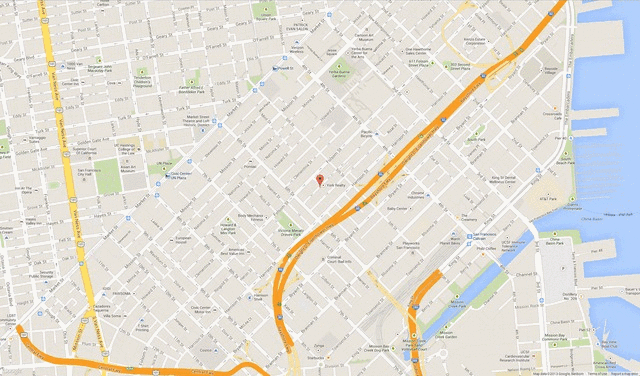
In the interest of fairness, it should be noted that the feature set between these providers is not the same. However, I tested/measured for what I believe to be the most common map use-case: Displaying a map around my location and highlighting stuff with pins drops/markers.
These are the different providers (and actual pages) that I used for the test. All these maps look and feel the same:
Note: The chart data does not include or take into account the page where I loaded the map from. (i.e. the chart data is purely the map data)
Based on these numbers, I plan to refactor my app to use Mapbox instead of Google Maps as, at least for now, it outperforms the latter significantly.
Finally, If you want to see some raw numbers, I have published this spreadsheet, I have also made the source of the different map pages used for this test available in Github here.